How To Make A Website Mobile Friendly
A mobile-friendly website helps your business look professional, load faster, and turn phone visitors into real customers. Learn what makes a website work better on mobile — and how WPB WebDesigns can build you a clean, responsive website with a free website demo before you pay.
What Is A Mobile-Friendly Website?
A mobile-friendly website is a website that looks good and works correctly on phones, tablets, laptops, and desktops. The layout adjusts to the screen size, the text is easy to read, the images resize properly, and the buttons are easy to tap.
When someone visits your site from their phone, they should not have to zoom in, scroll sideways, or search hard for your phone number. A strong mobile website makes it easy for visitors to understand what you offer and take action fast.
Why Mobile-Friendly Websites Matter For Small Businesses
Most people check out a business online before calling, booking, or requesting a quote. If your website looks old, loads slow, or is hard to use on a phone, visitors may leave and choose another company.
For service businesses, contractors, local companies, restaurants, salons, consultants, and professionals, your website often works like your first impression. A mobile-friendly website can help build trust before the customer ever speaks to you.
Your business looks more professional when your site works smoothly on mobile.
Clear buttons and contact sections make it easier for customers to reach you.
Visitors stay longer when the page is easy to read, scroll, and understand.
How To Make Your Website Mobile Friendly
Here are the most important steps to make a website mobile friendly and easier for customers to use.
Your website should automatically adjust to different screen sizes instead of looking squeezed or broken.
Use clear font sizes, strong spacing, and short paragraphs so mobile visitors can scan the page quickly.
Phone users should be able to tap your call button, quote button, and contact button without trouble.
Compress images, remove unnecessary clutter, and keep the design clean so your website loads faster.
Your menu should be easy to open and include your most important pages like Home, Services, Pricing, and Contact.
Your phone number, email, service area, and free demo button should be easy to see on mobile.
A mobile-friendly page should fit the phone screen without forcing visitors to scroll left and right.
Images should look sharp but still be optimized so they do not slow the website down.
Use helpful headings, strong page titles, internal links, FAQs, and clear service information.

Common Mobile Website Mistakes
Many business websites lose customers because the mobile version was not planned correctly. Even if a website looks decent on desktop, it can still perform poorly on a phone.
- Text is too small to read.
- Buttons are too close together.
- The menu is hard to use.
- Images are too large and slow down the page.
- The phone number is hard to find.
- The website has too much clutter.
- The page does not clearly explain the service.
- There is no strong call to action.
Mobile-Friendly Website Checklist
Use this checklist to see if your current website is helping or hurting your business.
Can visitors read the page without zooming in?
Does the website load quickly on a phone?
Can users find your main pages fast?
Is your phone number or contact button visible?
Does the page clearly explain what you offer?
Does everything stack cleanly on small screens?
Are images, boxes, and text lined up correctly?
Do you show location, services, reviews, or business details?
Does the page have a good title, headings, links, and FAQs?
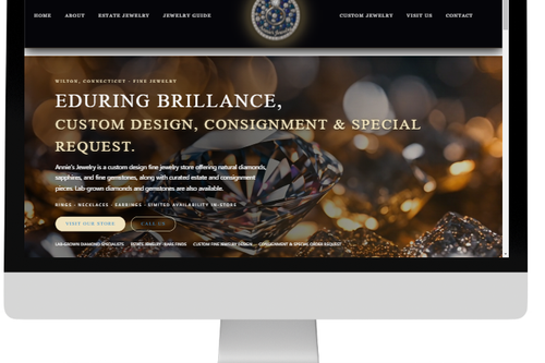
How WPB WebDesigns Builds Mobile-First Websites
WPB WebDesigns builds premium small business websites for Louisville, Kentucky, and surrounding areas. Our goal is to make your website look professional, load cleanly, work on mobile devices, and help visitors take action.
We do not just make a website look nice. We focus on the structure that matters: clear messaging, mobile-first sections, easy navigation, professional design, SEO-friendly headings, and strong calls to action.
With WPB WebDesigns, you can get:
- A clean mobile-friendly website design
- A professional layout for your business
- Website hosting options
- SEO-friendly page structure
- Monthly website plans
- A free website demo before you pay
- Support from a web design company that understands small businesses
View our monthly website plans or get matched with a web designer today.
Should You Fix Your Current Website Or Get A New One?
Sometimes a website only needs small updates. Other times, the site is too outdated and needs a full redesign. If your website is slow, hard to update, not mobile friendly, or not bringing in leads, a new mobile-first website may be the better investment.
The design is still strong, but the text, images, buttons, or mobile spacing need improvement.
The layout is outdated, hard to use, slow, or does not represent your business well anymore.
You need a professional business website that is built for mobile users, leads, and growth.
Frequently Asked Questions About Mobile-Friendly Websites
How do I make a website mobile friendly?
You make a website mobile friendly by using responsive design, readable text, fast-loading images, simple navigation, tap-friendly buttons, and clear contact sections.
Why is my website not mobile friendly?
Your website may not be mobile friendly if the layout does not resize correctly, the text is too small, the images are too large, the menu is hard to use, or the page was designed mainly for desktop.
Can WPB WebDesigns make my website mobile friendly?
Yes. WPB WebDesigns can review your current site and help you decide whether it needs mobile updates, a redesign, or a new website.
Does a mobile-friendly website help SEO?
A mobile-friendly website can help your SEO by improving the user experience, making the page easier to use, and helping visitors stay longer and take action.
What is responsive web design?
Responsive web design means your website automatically adjusts to different screen sizes, including phones, tablets, laptops, and desktops.
Do you offer a free website demo?
Yes. WPB WebDesigns offers a free website demo so you can see what your business website could look like before getting started.
Work With WPB WebDesigns
If you are searching for how to make a website mobile friendly because your current site is outdated, hard to use, or not getting results, WPB WebDesigns can help.
We build professional, mobile-first websites for small businesses that need a better online presence. Whether you need a new website, a redesign, hosting, SEO-friendly structure, or ongoing support, we can help you get started with a free website demo.
Email: wpb@williamsprobuilder.com
Phone: (502) 233-3777
Service Area: Louisville, KY + Kentucky
Services: Web Design, Hosting, SEO, Website Support
Ready For A Mobile-Friendly Website?
See what your business could look like online before you spend a dime. WPB WebDesigns offers a free website demo so you can review a custom concept before making a decision.
Get My Free Website Demo